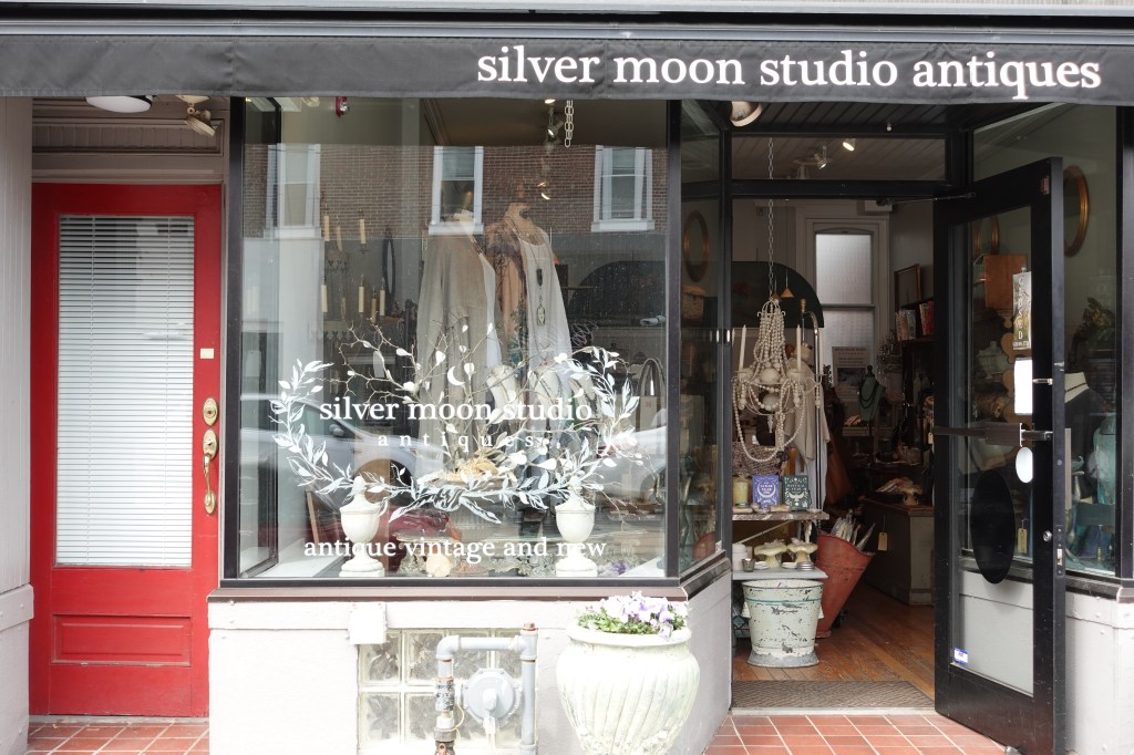
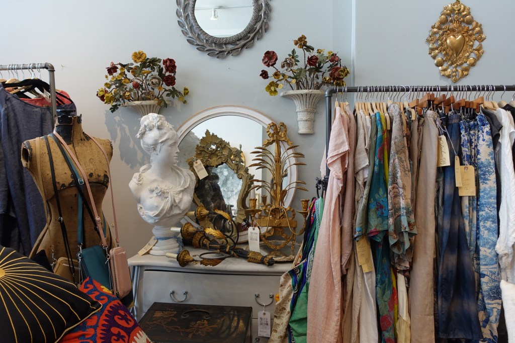
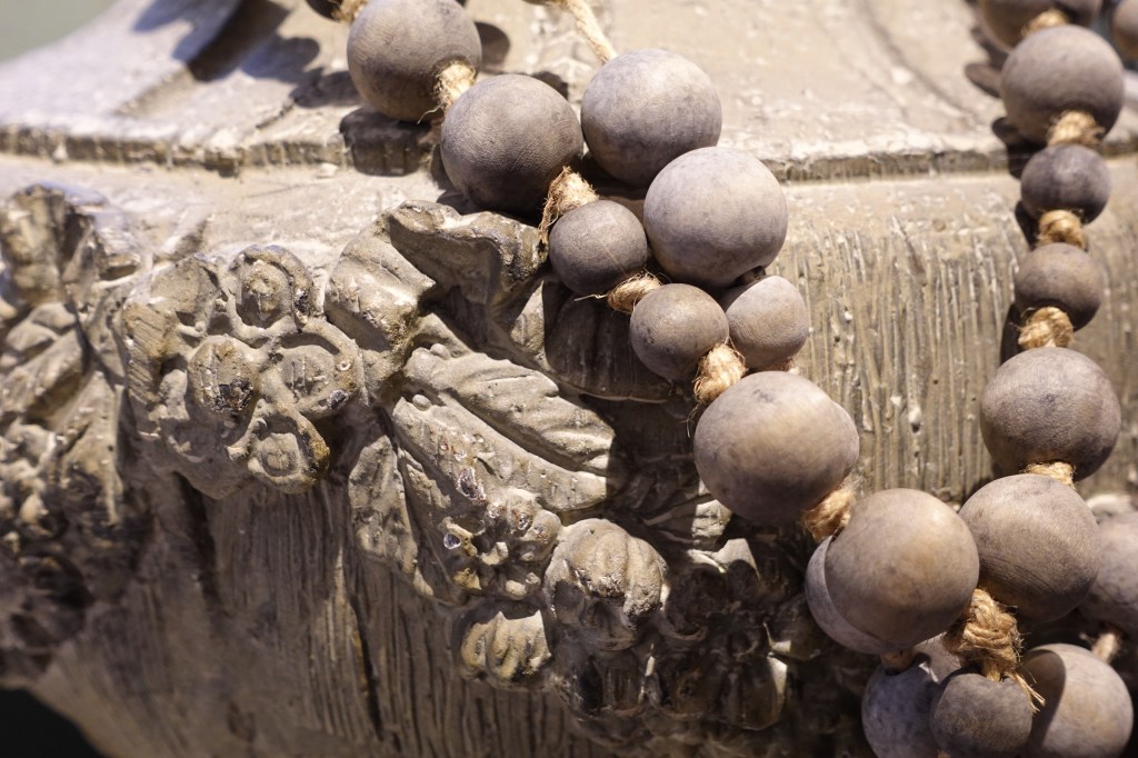
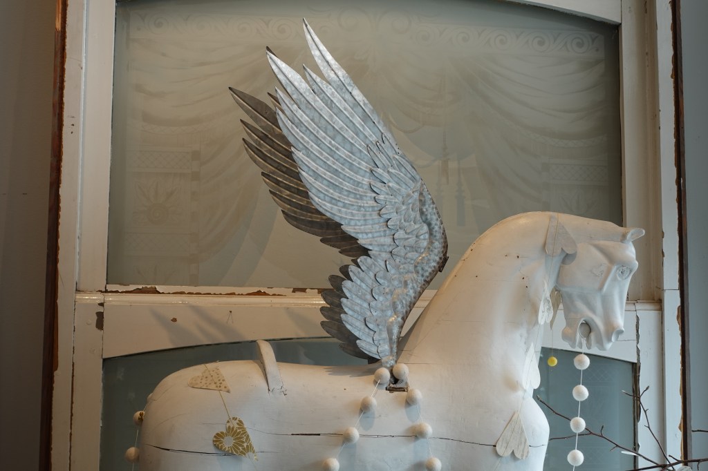
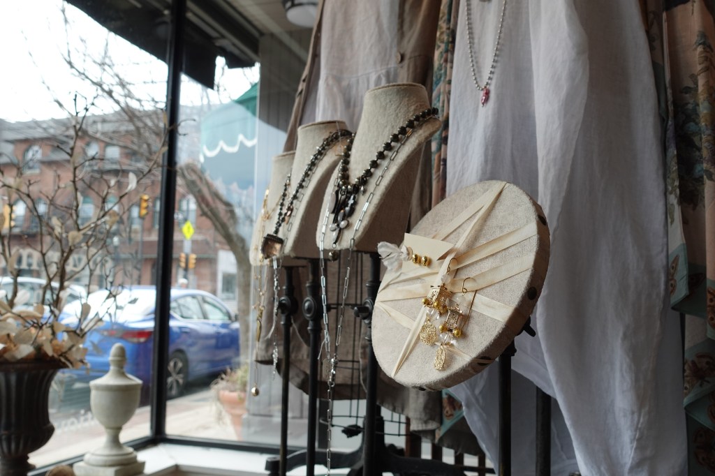
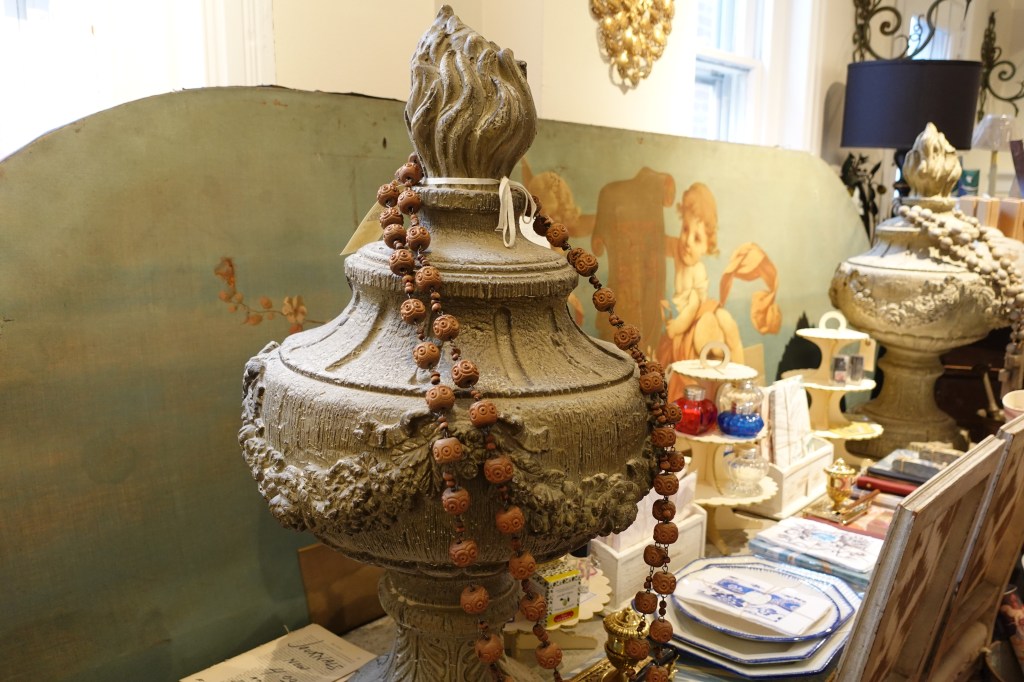
Silver Moon Antiques, residing on Media’s State Street, is the kind of place that catches your eye as you walk by. Returning customers are drawn inside by the aesthetic – a sense that you are encountering different places in time. Velvet furnishings, hand printed patterns, hand-made jewelry where modern and antique elements meet – capturing a specific customer, someone a strong sense of imagination. Wehler’s background includes a childhood spent moving approximately twenty-five times, a fine art degree, a textile design business in New York City, and more experiences that led her to the world of antiques and artisan made products. Wehler’s father developed satellite communication networks for AT&T, requiring the family to move to different countries. “I lived in France, Iran, Germany,” says Wehler. “Iran was the Paris of the Middle of East.” As an adolescent, she wanted to be anthropologist, but felt disinterested in the lack of enchantment in the field. “The only thing I felt unlimited with is art,” she says. Wehler studied textile design at Moore College of Art in Philadelphia, started her own company, and eventually began refurbishing and re-selling antiques – this would become Silver Moon Antiques.
Mystery, creativity, and personal growth are constant sources of inspiration and inform Wehler’s daily life. For her, fairytales discuss humankind “falling in consciousness” and neglecting a spiritual aspect of life, something Wehler feels very connected to. The practice of encountering artwork and reflecting on how it impacts us is an opportunity “to learn about what the soul is trying to tell us.”
“When everything else disappears and you are just focused on what you are creating, I think that’s really when you are connected to your soul,” says Wehler. Over the years, her creative practice has evolved from textiles and furniture to jewelry. She has also spent many years engaged in personal and spiritual growth. It has been a journey to finding freedom and living a life that feels meaningful to her. “We have to let go of the shame of what you are or aren’t,” she says. She has learned how to recognize and break unconscious, repeating patterns in her life, and to accept her unique qualities. She views life as a work-in-progress and believes that what society often labels a ‘mistake’ are just a part of the story. “Everything in life, good or bad, was set up for me,” she says. “We can grow from experiences instead of being crushed by them.”
Wehler’s essence comes through as you browse Silver Moon Antiques. Stones and antique pieces hold stories, and unique apparel and housewares invite customers to express their own vision. The stationary section (with fountain pens, textured paper, colored and scented inks) holds the building blocks of a self-exploration practice. These materials provide an experience to slow down, witness, and identify deeper aspects of self. Wehler’s intentionality is what makes Silver Moon iconic. For her one-of-a-kind jewelry, she says, “I put a little of my concentration and my energy into it. It’s going to be unique.”
Visit Silver Moon Antiques:
5 East State Street
Media, PA 19063
Open Wednesday-Saturday 11am-6pm, Sundays 12pm-4pm
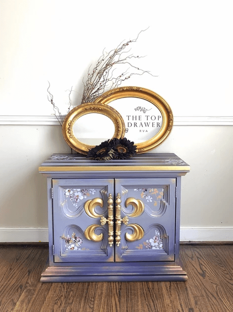
Melissa Eaton is the artist behind The Top Drawer. She creates sought-after designs that bring a distinctive, bold quality to a room. Eaton’s style embraces whimsical, and sometimes wild, design possibilities. She leads with her instincts, a quality that championed her business growth. Clients trust this quality when it comes to commissioned projects. Some trust her enough to say, ‘Do your thing. Do whatever you want to this piece.’
Clients expect unique textures, effects, and color combinations. “Sometimes, they give me a list of colors, or [reference] something of mine that they liked before,” says Eaton. Otherwise the designer works off of minimal references, often pushing the limits of home décor into an eclectic direction. “That’s what keeps things exciting,” says Eaton. “Life would be pretty boring if everything was beige and farmhouse. Sometimes, I think it’s important to throw a bit of color and whimsy in there.”
When Eaton purchased and painted an item for her own home she didn’t expect her life to take a new, creative direction. After the birth of her third child Eaton chose to put her career in nursing on hold to focus on her family. She had always sketched and painted here and there, and she decided to use this phase of her life to develop a creative practice. Overtime, she transitioned from various crafts into painting furniture, and eventually starting a business. Her designs caught attention on social media and she developed a following. Eaton also began live-streaming videos of her painting sessions online to share her tips and techniques. Now, as an ambassador for Dixie Belle Paint she is expressing her creative vision while demonstrating the design possibilities that their products offer. “I get to create beautiful things for [Dixie Belle], and in return I get to use this fabulous product and teach people about how to paint furniture themselves.”
When she live-streams her studio time Eaton values being open and honest as a way to help others overcome obstacles that block their creative potential. “People get a little scared about the process,” she says. Viewers often leave comments while watching Eaton’s live streams, and she takes the time to answer questions. “I’m very open when it comes to my teaching style. I’m doing these hour-long live streams on Facebook. I’m showing people from step-one-into-done. I just really want them to know that they can do it, too. Don’t be worried about what’s perfect because nothing is perfect. It’s just art. You’ve got to paint what makes you happy.” If a color or pattern isn’t working out, she lets them know that she’s about to do something different. Dropping her brushes, grabbing the wrong color – Eaton sees these mishaps as opportunities to help others overcome the fear of taking on creative projects.
“Art is basically free therapy,” she Eaton, citing creativity as a positive release through the ups and downs of life. “There have been days where I’ve gone out to the shed, put the music on, opened up all the paint, and got mad at a poor little piece of furniture…Sometimes, from that chaos, from that anger and emotion in your painting, the best things happen.” Most importantly, “When you’re done, you feel better.”
Eaton often shops for second-hand furniture to be transformed into products for The Top Drawer. “If I’m lucky enough to find something that’s fabulous for a wonderful price, I will take it,” but the self-described “thrifty girl” also repairs damaged furniture, making it a perfect canvas for her next idea. Hunting for older pieces to up-cycle means that they can require some extra TLC. “I get excited about trying new products, or trying new colors, and making something fabulous with something ugly or broken,” says Eaton. When asked about what her ideal pieces are, she says, “I’m lucky enough to be busy. This is a dream job for me to be paid to create. But I get really excited when I get something that is ornate and special.”
While she admires 1920s and ‘30s waterfall styled art deco furniture, smaller pieces are a welcome canvas. “If you’re lucky you can find an end table or a nightstand for ten dollars and under. Those are pieces that you get to creatively do something that you might not normally try.” She recommends smaller thrifted pieces, including jewelry boxes, for anyone just beginning their journey with Dixie Belle paints. “Those are the ones that you can play and experiment with – throw all of the color onto them,” she says. “You’re not worried that you’re going to ruin them because they’re only ten dollars.” Chalk mineral paint, Dixie Belle’s product, is a striking material. Their paints have character. “You’re able to be a beginner and still get an amazing look to your product,” Says Eaton. The company offers a variety of colors and finishes, as well as textured mixes –like Dixie Dirt and Sea Spray – that create unique effects. Like The Top Drawer the company is a woman-owned business, and Eaton appreciates being a part of this niche is the small-business world.
For any budding entrepreneurs who don’t quite know where to start, Eaton highlights the advantages of social media. Building connections with other artists, and being able to share ideas, is very important. Also, putting your product out there through social media is a valuable way to generate sales and build a following. “Social media is where my business is living. Who would have thought that a middle-aged mom of three would be hanging out on social media all day and painting furniture? I didn’t think it would be me, but I’m very happy that it is [me] at the end of the day.”
The creation of Carver: A Paris Story was the apex of many experiences for Chris Hunt. His first title, published in 2016, led to a series of opportunities with AMC, Filson, and Z2 comics. The artist resides in his hometown of Westerville, Ohio. He spent his early life in the Midwest, and later moved to New York City for a time. Creating comic books is a full-circle return to his roots, to the child who dreams of telling his own stories. Our conversation has an unexpected cycle, covering the topic of time again and again. How we use our time, the way that it quickens when you are out of your twenties. Most important is the eternal age that people feel. This stage in life is unique to each person and a place where pivotal experiences are layered like film negatives, never obscuring the core self. Hunt places himself at the age of nine, devouring comics and selections of his grandfather’s numerous history books. The only difference is that he has seen and experienced much more of the world.
Carver: A Paris Story (Z2 Comics)
Growing up, Hunt had an intense interest in storytelling and worked diligently on his illustrations, but his path to becoming a comic book artist would be unique. Degree programs in comics were non-existent in the early 2000s and art school couldn’t provide the experience that he was looking for. Raised with a pragmatic mindset, he made the decision to take a step back from the art form and pursue business instead. At the age of twenty-one he became one of the most successful managers at Starbucks on a regional level.
While Hunt found success, without comics he says, “I was heartbroken. It was like being estranged from somebody that I loved.” In 2006, his childhood comic book hero, Paul Pope, would release Batman: Year 100 (DC Comics). Hunt recalls going to Barnes and Noble and opening the volume that “reignited the flame” to create comics. It was an emotional awakening that led Hunt outside of his comfort zone to fulfill his dream. He sent Paul Pope a message on his Flickr profile, an online gallery and image sharing website, and quickly received a reply. Pope suggested that he draw with a brush and ink and stated that he would be disappointed with the first 1000 drawings or so. In search of a creative breakthrough on the other side of 1000, Hunt proceeded to draw diligently. On his own Flickr profile, he posted and numbered each illustration, and Pope left constructive criticism in the comments. The two would eventually meet and Pope directed him toward opportunities where he would learn the craft. They remain friends to this day.
After making the decision to follow the path that had been haunting him, Hunt says, “Something shook loose in my own perception of self and the world around me. Suddenly, everything became an opportunity. It was an opportunity to learn. It was an opportunity to research. I bent my existence toward learning the craft of comics.” This one decision would take him into a new, more fulfilling direction.
Filson Adventures (Filson 1897)
Before creating Carver: A Paris Story, Hunt spent many years learning about The City of Love. He remembers being a young kid who was fascinated by the baroque and historic qualities of Paris. He read the works of Ernest Hemingway, who lived abroad in the city for several years. At that age he knew that he didn’t comprehend all aspects of the characters’ experiences. He developed a “curiosity of context” which drove him to research. An intense interest in the Lost Generation of prominent American authors, best known for works in the 1920s, would open him up to music and more works of literature. Upon arriving in Paris in his mid-twenties Hunt was disappointed that it lacked the visual romance he had been dreaming of for so long.
It was in this city that he spent three weeks with an ambiguous love from Idaho, culminating in an adventurous night fueled by a bottle of Four Roses. After exploring the city, they found their way to Notre Dame Island, legs dangling over the waters of the Siene as they finished the bottle. The following day would begin to bring clarity for them both. “We knew that our relationship couldn’t top that [experience],” he says. “Suddenly, I started to understand Hemingway. I started to see that this was the subtext that I could never figure out. It’s kind of inherently sad because it’s all this thing that happens, and then it’s just over.”
The concept for the character Carver began as a sketch in Paris. This developed into a bittersweet, romantic comic. In the following months the true heart of the story would be solidified. Hunt tragically lost two of his best friends, one to a terminal diagnosis and the other to a train accident, experiences that changed him. He would pour himself into creating Carver: A Paris Story with new layers of loss and reflection. Creating Carver was an intense process, and on the heels of its publication he wasn’t sure that he had another story inside of him.
Eden: A Skillet Graphic Novel (Z2 Comics)
Hunt returned to Filson 1897, an outdoor apparel retail chain, where he had worked in the past. He didn’t anticipate that readers would bring copies of Carver to the store and ask for his signature. He also didn’t expect to receive the 2016 Comic Book of the Year award from IGN Corporation, a world-leader in entertainment media. It wasn’t long before his work caught the attention of Filson, which turned into their Filson Adventures web comic.
Hunt worked with Filson to tell the story of their brand in a graphic novel format and is currently commissioned for other creative projects with the company. In the weekly comic strip on Filson’s Instagram account, the old-world quality of the brand is a focal point. This was a challenge to articulate and translate into the world of comics. Of the salt-of-the-earth survivalist archetype he says, “It exists still, but it’s a part of this history. You can actually go out and engage the narrative in almost the exact same way that you did one hundred years ago.” These qualities of the Filson brand met the vibe of comics, which in the artist’s mind is something more like jazz – a fluctuating piece of music with a steady bass at its core. He cites his appreciation for character development and steadily slow-burning narratives as initial influences, but further collaboration would lead to more action-packed chapters.
Hunt is currently working on the second installment of the Carver story and has more projects on the horizon that he can’t reveal just yet. He states that in his downtime he is reading international comic books and seeking an elusive documentary about the comic book legend Hugo Pratt. Learn more about Chris Hunt and his work at thechrishunt.com
Diverse creative roles have been explored on Ordinary Artisans. Today’s story takes us into new territory with Lyndel Miller, a high-end product and food stylist. She has worked for print publications, commercial ads, and artfully arranged delicious-looking dishes on film (Swinging Safari [2018], Jungle [2017], and Netflix’s Tidelands [2018], among others.) An author, artist, and mentor behind The Styling Coach Sessions, Miller credits her versatile experiences with preparing her for where she is today. In a Q&A all the way from Brisbane, Australia, she tells the story of her journey from Naturopathy into styling, celebrating the creative challenges along the way.
How did you get started in the styling business?
I decided I would dedicate 12 months to trying to create a career in the industry. If I had no success or it wasn’t what I had hoped for, I would return to the Health Sciences and further my studies.
So, I studied, read, read a little more, practiced, practiced a little more and reached out to my community, speaking about what I hoped for. Not long after, a mutual friend connected me to a photographer who at the time was wishing to extend her portfolio in food photography. We met, hit it off and did a test together. Not long after she booked me for a commercial shoot. It was a rather ambitious one at that but we both nailed it. The rest is history, as they say. We’ve worked together ever since. I really have to say it felt serendipitous. Someone up there was looking out for me. It was just what I needed. I was off and running! Right place, right time.
Was this something that you wanted to do since you were little?
Ah, no, I always romanced the idea of being an artist, but I had no faith in the idea or myself. It felt out of my reach.
After high school I went on to pay for my own education, so when it came to furthering my studies I felt my choices should be pragmatic. At first, I studied Naturopathy as I had been cooking for leading health retreats. It seemed like the next logical step at the time. I had a lot of experience in hospitality growing up. I wasn’t interested in being a chef. Though I wish I had been encouraged to do so back then. I certainly did the hours. I did Graphic Design And jewellery making in my free time (I do bore easily).
I had a health clinic for several years but when I fell pregnant with my first born, I shut shop, with no intention on my mind of returning. I knew I needed something more. Different. I went on to study Interior Design and started painting and exhibiting my abstract nature inspired artworks.
Food styling always felt like a marriage of all my past experiences. All the past work granted me the necessary and broad range of skills I needed to work successfully in the industry. I also style product, interiors and lifestyle shoots. It all feels rather natural.
In retrospect I wish I did Bachelor of Arts, as I wonder what I may have achieved. But maybe I would be in exactly the same position.
Photo: Courtesy of Lyndel Miller
What made you interested in food styling?
I love food! I come from a family of foodies. I picked up an American book on photo styling, by Susan Linnet Fox. It was a page turner for me. I resonated with every page. It’s what motivated me to start in the first place. And food styling seemed like the perfect place to start. There also weren’t many around in Queensland. There still aren’t. But having said that, it’s a small industry.
What has surprised you the most about what you do?
The higher you reach the less egocentric the environment is. Thankfully. I found this rather surprising.
Working in film is a great joy. There is a real sense of teamwork and appreciation for each other. I value the opportunities highly and enjoy the comradeship.
Food styling is not as simple as it seems. Can you tell me about what takes place in each stage of production?
It’s not actually, not on a commercial level. It just ain’t all making pretty. What’s required for each stage? Mmm. I can’t really articulate stages. Each project is truly unique. It’s a process but very rarely the same one. It helps to be a multidisciplinary stylist. The more resourceful you are the better, and each job brings you another level of understanding, dealing with various individuals, their briefs (or lack of), client, logistical and budgetary restraints – all of which determines how you approach the job, meet and nail the brief. Stylists are also problem solvers. This comes into every brief. How to reach desired outcomes is at the forefront.
Photo: Courtesy of Lyndel Miller. Durham House, The Design Files, 2019.
You’ve styled food on films – Swinging Safari (2018), Jungle (2017), and San Andreas (2015). What is it like styling for a film?
Ah, I love it! Especially Swinging Safari! Meeting Production Designer Colin Gibson was a thrill, as he worked on Award winning Australian series Love My Way, which is my all-time favourite series, even now. Also, the amazing Justine Dunn who I’ve worked with on several jobs, San Andreas, and Tidelands. I’ve worked with some phenomenal crew.
I also had teeny parts on ABC series Harrow and Netflix’s Tidelands. Just cameos but all the same, it’s a joy.
It’s very rewarding even if it’s just the smallest of contribution, it’s a privilege to be asked to participate and support an Art Department with their bigger picture.
What are some unusual projects or highlights?
This year, it was a stunning still life brief for upcoming Regional Flavours Food and Wine Festival held in Brisbane. I was given creative license to present the regions fresh produce as an art form. It’s inspired me to create a print series which will be released later in the year.
Photo: Jessie Smith. 2017.
What is your favorite food to style?
I love to style oysters! I’m very drawn to the exotic… salads are also very satisfying. Setting a scene for a feast! The ultimate as I get to play more! Plus, I love a challenge.
What is the most difficult food that you have worked with?
Butter! Whilst it’s not the most difficult generally (or doesn’t have to be). My most difficult project was four days shooting in Hong Kong. We had many holdups with failing Airconditioning, power and refrigeration. One crew member cut them self badly, another had a motorcycle accident. On top of that, a very ambitious client. 100’s of butter curls and cheese pulls! It was a challenge and exercise in patience and endurance. We worked for 23 hours straight, but the crew was phenomenal. We managed to have a lot of fun, and many lifelong friendships were made. But, as you can imagine, it was exhausting. I fell in a heap afterwards.
This is a silly question, but do you take care to arrange your own food at home or judge the plating when you eat out at restaurants?
Haha, I am asked this so often. Weekly. So, it’s not a silly question. I’m pretty relaxed at home. I love fresh, pleasant style food, shared plates, when everyone just serves up their portions and dig in. I only lay it all on for special milestone birthdays and Sunday family lunches – I consider the plating and propping. And I’m not one to judge others. I am however disappointed dining out if there is no sign that the food presentation isn’t considered. Can’t stand wilted salad greens, and any short cuts. Food deserves time, and you can taste a lack of care. I love visiting restaurants when the chefs take the food to art.
You’ve authored two books, “Naked Cakes: Simply Beautiful Creations” (Murdoch Books 2015) and “Wild Sugar Desserts” with Skye Craig (New Holland Publishers, 2012), with recipes and whimsical, artistic cake designs. What inspired you to write and share some techniques?
“Wild Sugar Desserts” was a co-authorship. Skye Craig used to work as a graphic designer for my husband’s business. We had a mutual appreciation for each other’s work. I was an exhibiting artist at the time with a background in design. Skye initially engaged me as consultant and stylist a few weeks into discussion around the book production. We decided that a nostalgic approach was fitting for this genre.
Skye asked me to author the book with her. She contacted the publisher and her agent, I submitted some recipes, an outline and we got the go ahead. It was very exciting, but all very consuming for a good 12 months. I learnt a lot! I created and tested about 100 recipes in the process. It was labour intensive. The design process for propping and plating was an equally, if not more, exciting experience. I invested a lot into it, and who couldn’t. It was an amazing journey. It was very successful in Sweden. Go figure!
A year later I went on to produce cookbooks for self-publishers. I enjoyed the processes so much I wanted to assist others in creating their projects.
The second book idea I pitched to Murdoch Books. It was one of two pitches. To be honest I didn’t think it was the most favourable. It was a book idea for a gap I saw in the market for the growing and trending love for The Naked Cake. Many books came after mine, but it was the first on the subject.
I love a celebratory cake! I’m actually not a sweet tooth but birthday cakes have always been a big deal in my family. My kids get to choose the style of cake they want, the flavour profile, and the setting in which it’s delivered to the table. The book was ultimately about this. There were some aspects of the book that I was asked to produce (the crafty elements and D.I.Y. tutorials) that I wasn’t too keen on.
I’m very grateful for the opportunity! It gave me a great body of desserts in my portfolio. 70 odd. And extracts of the book were published all over the world thanks to my amazing publishing manager. It just wasn’t a true reflection of my style, so that’s hard to swallow. But it has been successful (for a nobody) and it’s been printed for UK and German market. It was a blessing(!) as I was just starting out as a food stylist. Having said that my first paid gig was a high-end kitchenware client, producing their annual Christmas catalogue.
Photo: Mindi Cooke. Kalka Homes. 2017.
On Instagram you’ve mentioned that you collect vintage glassware. Why do you love colored glass?
What’s not to love ! Vintage glasses offer eye-catching colors and an array of shapes and patterns, unique decorative accent that recalls craftsmanship of times past. Colour also offers another layer and interest. And most importantly they are usually smaller in size and make for a more user-friendly prop, for stills anyway.
They also just add to a dining experience. I’d rather sip from an alluring vintage glass than a regular highball. Who wouldn’t? I’m a hedonist. It’s all about pleasure. It is also a nod to sustainability.
What are some standout pieces in your collection?
I love them all, but the standout? A pair of mid-century brandy balloons with gold trimming. These were gifted to me by my mother. I think the artist is Brownie Downing. I’d love to know who made them. Maybe one of your readers may know. I have my Friday night Gin and Yuzu cocktail in them. They are a treasure. They are playful and well, I’m sentimental. I won’t use them as a prop, they are just for me. I’d die if I broke one.
I also have some rather space age looking martini glasses. Much like the ones you may have seen in the recent Starwars: The Rise of Skywalker movie and club scene. Designer Tom Ford has a similar range out now, reminiscent of the 60s.
Photo: Mindi Cooke. New Farm Confectionary. 2019.
What is your favorite era of food styling and why?
Right now! We are seeing a resurgence of still life, echoing the Dutch Masters but with restraint. This excites. But I’ve always dreamt about working on a massive food scene like the ones you see in Harry Potter or Game of Thrones. Big budget! Mountains of produce and detail.
Having said that, working on the movie Jungle with Daniel Radcliffe was extraordinary. That brief was demanding which I thrive on, stimulating and enjoyable. I got to sleep on the set the day prior at Versace also. Smiling widely. Dream job! Dream crew.
What are your upcoming projects?
I can never give away what’s up next, but it’s a mixture of food, product, and lifestyle stills and TVC’s. Business as usual but I’m finding the caliber of work I’m receiving is exciting.
I’ve also just recently launched ‘The Styling Coach’ sessions. They are crash courses in photo styling. I’m not one to rest on my laurels. I love to have a few projects on the boil.
These 1:1 sessions are geared for small business startups wanting to learn how to better style their products and images for social media content. And, for corporate hotel groups wanting to give their marketing teams insight into the craft of food styling and how they can up their game plan for their social media posts. It’s been a great success.
I’ve also vowed to myself to produce more personal projects, which I haven’t done for years since my last book. I’m collaborating with a few photographers this year to create print series for interior decorators/ designers and public alike. I’m returning to my art. Painting. This time not just making photographic backgrounds for camera.
I want to spread my wings a little more this year and make time for my own creative urges. I’m writing more and always trying to up-skill.
Jennifer Kramer is a fine artist and art therapist. While she creates moving works of her own,
Kramer also guides others to use the arts as a tool for growth. As a Registered Art Therapist Kramer’s wealth
of knowledge relates different visual art mediums to mental and emotional
states. In her practice, the act of
expression is the key to finding one’s own voice or decoding the buried and
locked parts of the self. The internal
shifts that happen within the experience of art making itself can usher a
person towards healing.
Kramer was raised in Louisville, Kentucky where she resides
today. Growing up, Kramer and her twin
sister were exposed to many forms of creative expression by their mother. Early on, she felt motivated to use the arts
as a way to give shape and form to her internal states. Eventually, Kramer would study art therapy
and use her gifts help others facilitate their healing process. “It’s not an art class. There are not right or wrong answers. There is no end result that they are trying
to get. It is about expressing
themselves. It’s about the
process.” Each of Kramer’s sessions are
a “judgement-free zone” where mental and emotional shifts that happen during
the creative process are the focus. At
the end of a session, Kramer calls the canvas “a visual representation of the
process that you went through in the session and a metaphor for what you need
to apply in your life.”
“I challenged the surface”
The ways in which materials relate to different emotional
states is an important part of each session.
Resistive versus fluid materials range from hard to soft. Easily controlled, resistive mediums (like
pencils with hard lead) work best for those with an anxious temperament. Loose mediums, paints and soft pastels, can
be freeing for some people, but overwhelming for others. “Initially, I observe what they gravitate
towards,” she says, “I offer a variety of drawing materials and gauge whether
they can handle paint or not.”
In her own art practice, Kramer balances the healing of free
expression with the narrative quality of creating a series of work. Earlier in 2019, she was invited by Sojourn
Gallery in Louisville to be a part of an exhibition. As the date drew near, the gallery asked her
if she had enough work to be shown solo.
Kramer went to the studio, refining unfinished pieces and expanding her
overall concept for A Heart Made Visible. This collection of work chronicles her
personal experience with emotional abuse.
The buildup of those years turned into a diverse collection of
work. “I would stand there with huge
pieces of paper taped to the wall and run my fingers down it – filled with
paint – letting out all my emotions onto that wall. It was a time of me just releasing all of the
things that I needed to release,” she says.
Kramer’s process often involves free-form expression with fluid
materials, then a process of refining the overall message with lines and
shapes.
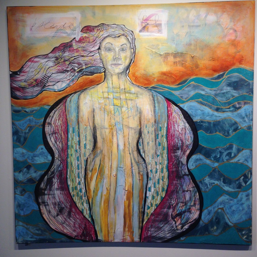
#3 “I am trying to see outside of this, but can’t help that I’m changing”
#4 “I don’t recognize him because stability is suddenly lost”
#5 “I feel connected, but I’m not sure where he ends and I begin”
A Heart Made Visible began with nine paintings featuring a circle, a symbol of completeness and, in this case, the survivor. Tranquil blue with an energetic shock of turquoise are accented by the grey cast of ocean pearls. We a see a person who is nurturing, relational. They move through the world radiating a light from within. In the proceeding images they are surrounded, caged, tossed about, invaded, and fragmented. In the final images a bright seed of hope grows larger and solidly present. These works tell a story of an uncomfortable, but tolerant, beginning, that leads to full-blown despair and loss of self. When the circle can no longer see itself for all of the darkness, it emerges to begin standing on its own.
Larger works continue to unfold the narrative of A Heart
Made Visible. ‘I Am Making Sense of
the Senseless’ is a graphic, defiant composition whose definitive qualities
seem to smooth the wrinkles of the crumpled and torn canvas on which it
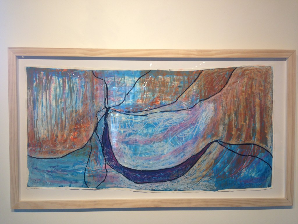
exists. ‘I Challenge the Surface’ speaks
of earth and ocean, of pushing through a pocket of darkness and peering into
new territory. ‘I Am Commanding Calm’
portrays a figure that is feminine and dreamy, but with solid boundaries. The waves may crest around her, but she knows
where she ends and the external forces of the world begin. Her vibrant identity is unmoved by what is
happening around her.
“I am making sense of the senseless”
Kramer began facilitating workshops for adults in 2019. Her workshops for women encouraged attendees to
explore aspects of their identity through the arts. Today, Kramer continues to create in her
studio in Louisville’s Mellwood Art & Entertainment Center. Learn more about art therapy sessions, and
Jennifer’s own work at jenniferakramer.com.
You may not have heard Justine Dunn’s name, but chances are that you have seen and admired her work. Her Art Department credits include diverse titles, Crazy Rich Asians (2018), Thor: Ragnarok (2017) and Anna and the King (1999) among them. She has been a set decorator, props master, and senior buyer for major films and acclaimed television series’. The artist played a major role in bringing the world of Orphelin Bay to life in the Netflix series Tidelands (2018). Dunn, and the entire creative team, portrayed the gritty, working-class fishermens world against the glamorous mystery of the island L’attent. The thread of folklore, and a romantic web, hung between the two settings in the script and in the visual design. Learn more about Justine Dunn and her work on Tidelands in our Q&A below.
How did you get into the world of
production design?
Originally, I studied for a Bachelor of Arts in Theatre at Queensland University of Technology and specialized in Stage Design in my final year. As part of my course we had to participate in work experience, which lead me into the world of TV commercials where you have 30 seconds to tell your visual story. The planning and detail of every shot by the Art Director and Director of Photography was fascinating. I didn’t even know such a job existed. After a short stint in the TV commercial world, I realized I was more interested in the bigger, more meaningful stories of Film and TV Series where you can develop whole worlds based around the script and its characters.
What drew you to scenic design?
The Production Design and Set Decoration roles are part of the story telling process. I have worked in many different roles that fall under the Art Department umbrella – On-Set Standby Props, Props Master, Buyer – but through Set Decoration we can build on a character’s background with the things we place around them in the set. The set decoration and background set should complement the story with colour choices, fabric, wallpaper and textures, lighting, furniture choices etc. For example a film set in the 1800’s will be researched for appropriate examples of what we know about the character i.e : age, occupation, gender, class, family history, Nationality, economic status. But if we don’t have much information from the script, we create a backstory that helps us make the creative decisions for each set.
Dunn working on set.
Describe your most memorable
projects:
“Anna and the King”
filmed in Malaysia in 1999, starring Jodie Forster and Chow Yung Fat. Designed
by Luciana Arrighi, it was nominated for an Academy Award in Production Design.
It was the first film that I had worked on that was on such a grand scale, but
still with amazing attention to detail. With the restrictions of filming a story set
in Thailand, but actually building the film sets over the border in Malaysia (a
very different aesthetic and culture from Thailand), 1000’s of extras,
elephants carrying actors, dinner parties for 300 people, it was epic. We had
to smuggle statues of Buddha over the border into Malaysia for filming, as we
had to re-create the Emerald Buddha Temple for the final scene of the film. I
was based in Thailand as the Props Buyer, sending props and dressing by the
truck-load over the border into Malaysia. I used to spend every Saturday with a
wad of cash the size of a house brick at the ChutuChut Markets looking for
fabrics, carvings, furniture, ceremonial and religious items, lighting, boats …
If you could live in one of the sets
that you’ve worked on, which one would you choose?
Great question and
I often think about that when I’m working on a set ‘What would I do if I was
living / working / hiding here?’ Probably
the Jones House in “Swinging Safari” (2018). It was a cool party pad with sunken
lounge and shag-pile carpet. It had a massive deck and a pool and a great
record collection.
“Tidelands” premiered on
Netflix here in the United States last December. You were a part of
the production team. What was the
creative vision for “Tidelands” before the show came to fruition?
It was writer
Stephen Irwin who came up with the story and concept. We were given a detailed
character breakdown, which gave us a lot of history and backstory for a
realistic, grounded approach to a fantasy genre. Production Designer Matt
Putland and I wanted to create a world that felt like the Tidelanders could
have been living amongst us for centuries unnoticed. The actual commune of
L’attent, we wanted to feel historical, symbolic and have strong links to the
sea and water. We wanted the rest of Orphelin Bay to be grungy and look
functional, like the Devil’s Tail, Bill’s Boat, and the Fish Co-op.
Is the premise of the show based on a
particular myth or legend?
It is a world created from the imagination of Stephen Irwin (the Writer and Co-Producer) then fleshed out with the input of Tracey Robertson, Nathan Mayfield and Leigh McGrath from Hoodlum Productions. Because Stephen is a novelist, he wrote the backstory for us and we received an extensive dossier of the Tidelanders history.
The set is very imaginative. L’attent (the island where the sirens live) could have been a cliche beach-y design – all tan and turquoise. Instead, the island feels like an otherworld. Adrielle’s house on the island is a very rich setting. Lots of velvet and dark wood. What was the inspiration for this?
We wanted to show a history and tradition of the Tidelander people. So, we wanted the house to be historic, not modern. The colour palette was a selection of sea greens and dark, inky blues with flashes of silver, like an underwater effect. We placed water elements throughout the set and used all practical lighting which always looks moody against the glossy dark wood. We knew there was going to be a lot of bloodshed…
How long did it take to create
Adrielle’s house?
From construction drawing to completely dressed…9 weeks and that is 3 different departments with slight crossover: Construction, Scenic, then Set Decoration.
Where did the inspiration for the
stainedglass window come from? Also, who made it?
Matt Putland oversaw the Design Assistant Stephanie Brooke, who drew it by hand then transferred it to digital. It was symbolizing the matriarch of the Tidelands with her people at her feet. It was actually printed onto vinyl in full scale then transferred to glass, each section stained individually, then edged with a substitute to look like lead-light. It had to be reworked a few times as one of the first versions was ‘too busty’ …LOL !
What was your favourite feature on
the set of “Tidelands”? Furniture, wall
color, etc.
Definitely the sparkly wallpaper (From Zepel Fabrics) in the Foyer of Adrielle’s house… but I also really loved the 5m drop waterfall drapes in the main hall …and the bespoke resin filled dining…and …
Follow @justdunnthis on Instagram to learn more about her work and see behind-the-scenes images from Tidelands and her other projects.
I began drawing very young, probably as soon as I could hold a pencil. My parents encouraged creativity to the fullest extent. I have two sisters, one older and one younger, and the three of us were always making something together. We were usually found spread out at the kitchen table with paper and piles of crayons. We would come up with funny characters to make each other laugh. I think my art today allows me to stay connected to this part of me….the little girl at the kitchen table giggling about her drawings.
Do you prefer one to the other?
I love and need them both and because I always have a few projects going at once it’s nice to bounce back and forth between the two. I love the simplicity of drawing with a graphite pencil. When I draw I don’t have to think about color and there is immediacy to translating my ideas to paper in black and white. I also enjoy the methodical process and planning of my drawings. Painting can be more liberating in that the paint itself is more forgiving and allows me to give up some control. I can let the colors of the paints and the shapes on the canvas direct me and there’s definitely more of an evolution that has to happen in my paintings as compared to my drawings. I love both processes equally!
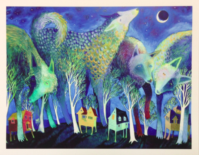
What is your favorite animal to paint?
It goes without saying that my favorite animal to paint is the wolf. Wolves have always captivated me. When I was young I would look at pictures of wolves and draw them constantly. My best friend and I were always pretending to be wolves, running through the woods and howling. It makes me laugh thinking about it. I sort of gave up painting wolves as I grew up in high school and early college. In a way it feels like I was maybe trying to push away a part of myself in order to ‘grow up’ and take art seriously, maybe taking myself a little too seriously. Like most art students I was focused heavily on rendering the human figure and painting and drawing from life. My work in school was highly academic and a breakthrough happened for me during a critique to apply for the BFA Painting & Drawing program my sophomore year at SUNY New Paltz. I stood up with all my figure studies and still lives and my professors commended me on technique and artistic abilities and then they gave me a big fat “HOWEVER” and went on to say that my work was boring and that I needed to figure out what made painting fun for me. In short, I started painting wolves again and stepped into my own wonderland in oils. I was reconnected with a part of my inner child that was buried beneath uncertainty. I think that allowing myself to reestablish this connection helped me in all aspects of my life.
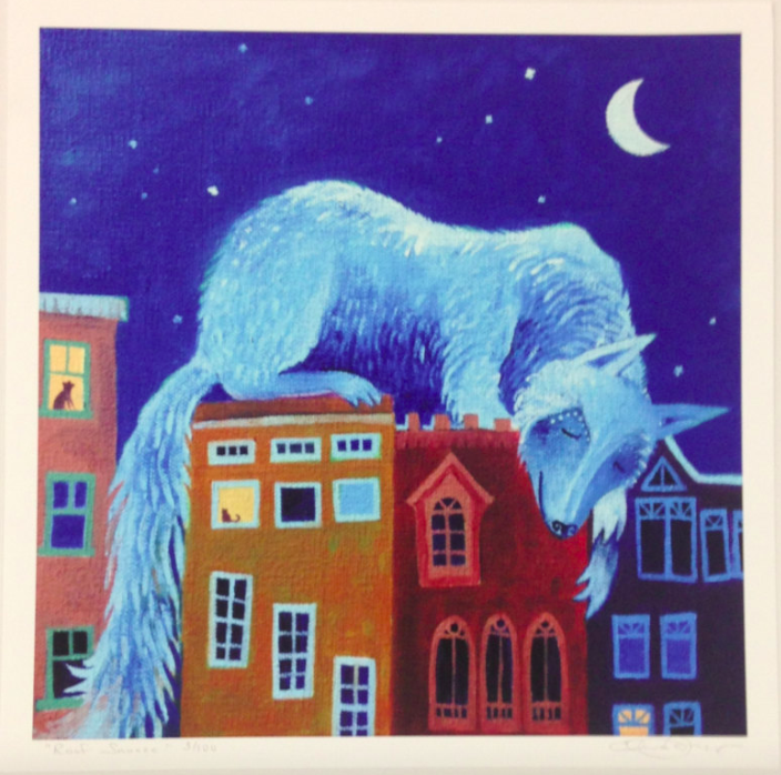
Roof Snoozer
Do the animals symbolize different qualities to you?
They definitely do. I think the big friendly wolf creature that I paint symbolizes a wildness or freedom that can easily get shut out in our modern hectic lives but watches over us and begs us to nurture it. For me this wildness lies in the necessity to stay connected to my inner child and to nature.
The little footed house that I paint symbolizes the comforts of the modern world and what we’ve come to call home. So when they interact together on the canvas they represent what home is for me (and for many people I believe)…a balance between the beauty and wildness of the natural world and the comforts of modernity. I also believe that our natural world should be revered and respected so there is definitely a nod to this in my subject matter. If we cherish Mother Nature she will take care of us.
Have you ever encountered a wolf in person?
I have not encountered a wolf in person. I have seen fox and coyotes up close in the wild. They are equally beautiful and enchanting. The closest encounter I had was with a coyote while thru hiking the Vermont Long Trail with my husband, Zak, and our dog, Balu. One morning while Zak finished packing up at the shelter I hopped on the trail early to get a head start with Balu. Although we usually let Balu walk without a leash (he’s very good at staying close) something in my gut told me to leash him up. I clipped the leash and continued up the path and suddenly a large coyote crossed the path just 15 feet in front of us. He paused and stared and then darted off into the woods. I think Balu was just as stunned as I was.
I also think I encounter a little bit of wolf spirit in Balu every day. One of my greatest joys is walking with my dog, off leash, in the wild. It’s easy to see the pleasure he feels when he’s free to nose the leaves and sprint down the path. It’s as if something comes over him and he can be his true doggy self and reconnect with his roots.
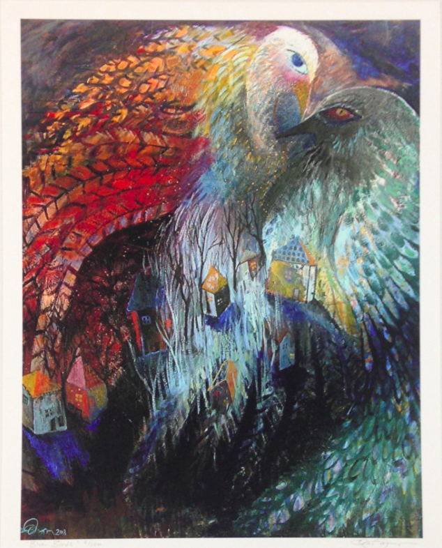
Blue Birds
Are there any creatures that you do not like?
I don’t like bedbugs very much! Or ticks! All in all, I appreciate all creatures for their uniqueness and roll in helping the world go round.
Your artwork is very whimsical. Are you drawn to whimsy in other areas of your life?
Of course! I love all things that spark the imagination in a whimsical way….music, movies, road trips, laughter, the things I collect to decorate my own home, time spent with my husband and dog, simple walks in the woods…I can find whimsy in all these things.
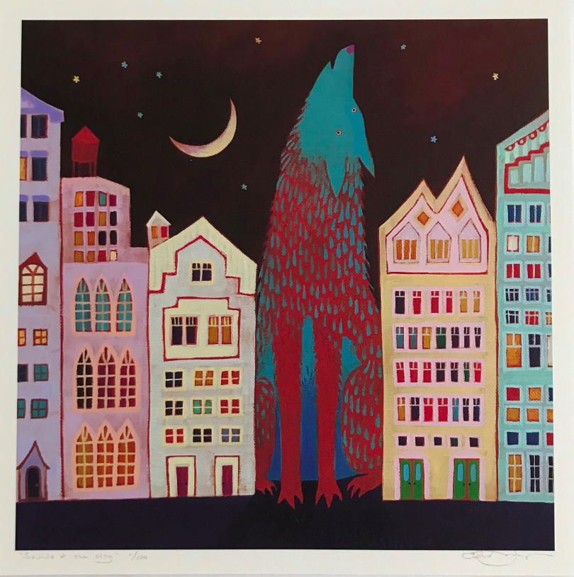
Around and Around
What led you in this direction?
In terms of the direction of being an artist it’s just something I have always possessed and it’s the one thing I can do really well. So a path towards art school seemed the best path for me. After college I didn’t really know what to do with myself and like many artists I picked up a fulltime job completely unrelated to my art degree…I was cleaning rooms at a high end hotel in New Paltz and making bank (believe it or not). Six months after I graduated and full swing into the busy summer season at my housekeeping gig I fell into a depression having not picked up a pencil or paintbrush since my thesis show. Exhaustion left me with no energy to muster up creativity. After much deliberation my husband, who was also working with me at this same job, and I walked out of the job in the middle of a busy Sunday and drove over to High Falls to jump in the river and come up with a plan. That’s where we dreamt up the idea of selling my work at art and craft shows. We booked our first show, made a little cash and the business has continued growing ever since.
In terms of the direction my work has taken, that happened in college after that fateful critique I described earlier. The decision to paint what I want to paint opened up a whole new world as seen through my mind’s eye. I like pictures that tell a story. I like pictures that make you happy. I like silliness. So naturally the world I create in my paintings and drawings is a happy and silly one. It’s a world that is growing in my imagination and I hope that I can write and illustrate some books about it sometime in the near future.
Who are your favorite artists?
A few of my favorite artists and illustrators are Marc Chagall, Edward Gorey, Barbara Cooney, Maxfield Parrish, Beatrix Potter, Don Wood and Martin Ramirez.
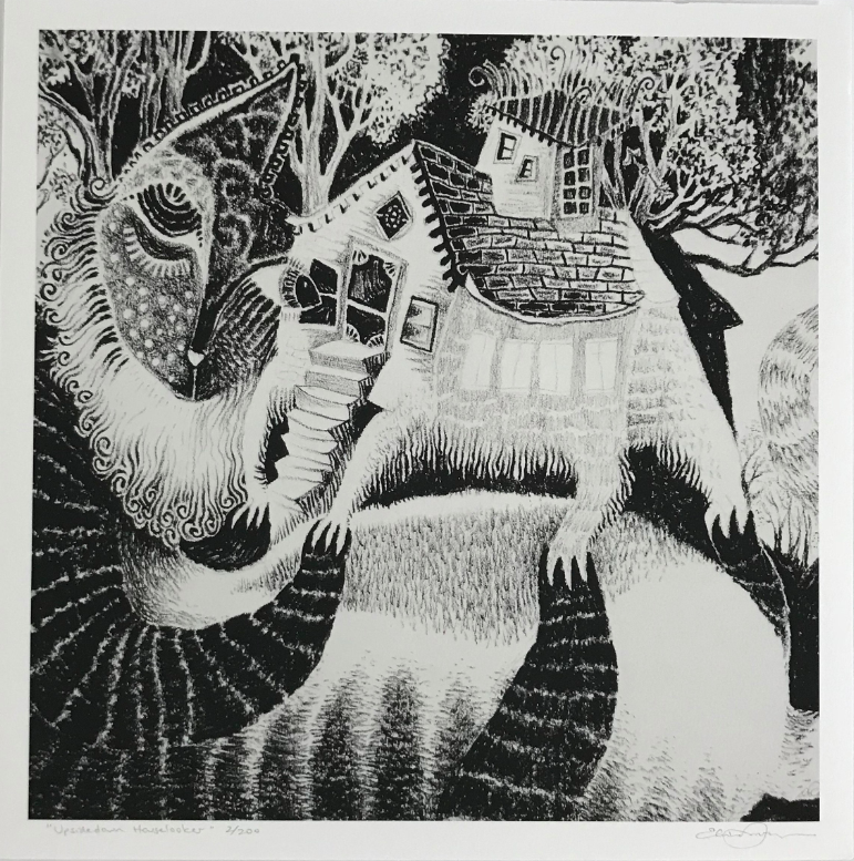
Upsidedown Houselooker
What is the most unexpected thing that has come from your art? (travels, conversations, projects, etc.)
I think the most unexpected thing that has come from my art is that it is providing for me. Even though I always knew that I needed to keep art in my life and even though I took a path that lead me to art school I don’t know that I ever truly believed I could be a working artist. I am continuously amazed by and appreciative of the people who fall in love with my work and show their support. It means so much to know that my work inspires people, captivates them, charms them and often times makes them laugh out loud. Sometimes I make a drawing that is so ridiculous (take the drawing of two bunnies playing a French horn with the ‘wrong end’ of the horn blower for example) that I think, “there is no way anyone is going to buy this one” and to my shock and delight it sells at it’s debut show and the prints become best sellers. That’s the most unexpected thing to me….that there are some wonderful, beautiful and incredible people out there who make a connection with my big friendly wolves or French horn farting bunnies. And the most unexpected thing of all is that they love them enough to add them to their own art collections, which allows me to sustain and grow as an artist. A lot of these people have become friends over the years and I look forward to seeing them as I travel the art show circuit. I am forever grateful to the people who make my life as an artist possible.
What do you like to do when you are not painting?
I enjoy daily walks with my dog, Balu. We walk or jog everyday before heading upstairs to the studio. My little family of three (Zak, Balu and me) love taking trips. We take trips to visit with family or trips to go to art shows or hiking and camping trips. My husband and I enjoy a good project. Right now we are doing a camper van conversion, which entails building out the interior of our Ram Promaster van to include a queen size bed, tiny kitchen with sink and stove top burner, cabinets for storage, and even a shower. This van, who we lovingly named Blanche, is our ultimate road trip adventure mobile and also my mobile hotel room and art show hauler. Right now the Blanche project is taking up most of our free time as we plan, scheme and make weekly trips to Home Depot. I also like to cook, usually with the music turned up loud. I enjoy vegging out to Netflix… usually something in the comedy genre. Weirdly, I like cleaning my house with music blasting and accompanied by frequent dance breaks. I also love just good old-fashion daydreaming with a doggy by my side…and the music mellow.
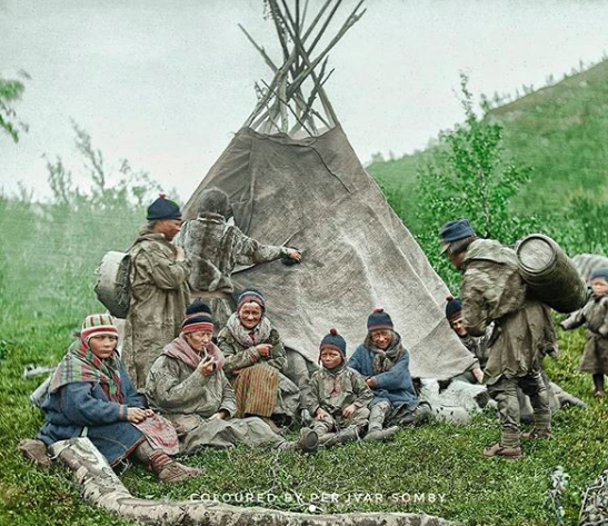
Anna Aslaksdatter Gaup, and Anna Jonsdatter Somby, from Kautokeino in Finnmark County in Norway, where Somby’s ancestors lived. Taken by Sophus Tromholt, 1883.
ColourMyPast is a collection of historical photographs of the Sámi people. Per Ivar Somby, author (“People Under the Northern Lights”) and IT specialist, created this Instagram account to share this little-known and misinterpreted part of history. The Sámi, indigenous Europeans, have a rich heritage and originally inhabited the Sápmi Northern European region, a territory that includes portions of Norway, Sweden, Finland and Russia. Pursuing his interest in his own roots, Somby learned how to colourize historical black and white images. ColourMyPast has almost 9,000 followers, and Somby hosts events in his hometown in Norway to show the Sámi culture in color. Through social media Somby has helped others connect to their ancestry. He has highlighted both the beauty of Sámi culture and the struggles that the marginalized group has faced. Learn more about Somby, ColourMyPast, and Sámi culture in our interview.
Where does your interest in Sápmi history come from?
Sápmi’s history is also my history. As a Sámi, I have always been
interested in my family’s history, and that include also the story of
my people.
What captivates you the most about the culture?
It’s actually the fact that the culture has survived through harsh
suppression for over 100 years, but still has managed to keep language
and traditional cultural life, art, and music alive.
Why did you start collecting antique photos and colourizing them?
I have been familiar with old anthropologic photos of Sámi people from
the 19th century since I was a child, and also been told that some of
these people were my ancestors. When I re-discovered many of these
images on the Internet a few years back, I felt that I wanted to know
more about my ancestors, and get some kind of connectivity with them.
As gray and ghostly figures I did not get to know them as they
possibly were, so when I discovered a colourized photo of Abraham
Lincoln on a site, a photo that was so well presented in colors that
it looked like a colour photo, I decided that I wanted to face my
great grandfather in the same way.
What are the most exciting experiences that you have had as you
research and work with history?
I share my colorized photos in Facebook groups and Instagram, and
meet an engagement from other Sámi people that feel a proudness that
has been uncommon in Sámi communities because of the suppression we
have encountered as the eldest European native people.
Together we learn more about our story through the last centuries, by
sharing stories, photos, and find common ancestors.
Why did you decide to create your book “People Under the Northern Lights”?
At first I made local photo exhibitions with another enthusiast. We
met a high engagement among both Sámi people and other local people,
that to me was a little surprising. They wanted to see more, and many
had not managed to come to these exhibits.
So I decided to take these photos from the exhibits, colour up some
more from this sequence from this particular photographer – Sophus
Tromholt, through the years 1882 to 1883 – and publish it in a book for
all to see. And it also meant something to me personally, as many of
the people presented in this book, are my ancestors.
What is the colourizing process like? How do you convert images from black and white to colour?
If possible, I do research on museum sites on traditional clothing. Then I adjust the gray tones in the photo to fix the errors in the camera’s orthocromatic style. Then I add the colours. I guess them all, but have some leading clues. After coloring, I adjust the photo’s toning, white balance and contrasts, in general.
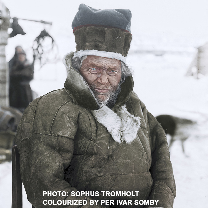
“Clemet Gundersen, my 3rd-great grandfather. He was 80 years old when the photo was taken in Kautokeino in Finnmark County in Norway, where my family has its roots.”
You mentioned one photographer whose images you colorize (Sophus Tromholt). Are there any other notable photographers who photographed the Sámi people?
Many anthropologists that did racial biologic studies took photographs. Though their actions are not considered good work today, their photos are often very well done. I mention here the French anthropologist Prince Roland Bonaparte and his photographer G. Roche (1884), and the Italian anthropologists Paolo Mantegazza and Stephan Sommier (1879-1885). A woman, Lotten von Düben photographed in Sweden, the Sami people there, while her husband Gustav did research on the Sami people (1868-1872).
Other photographers in Norway, like Anders Beer Wilse, Knud Knudsen, Johan Erik Wickstrøm and Lars Larsen Ingulfsvand are among the ones I find interesting.
What do you want the world to know about Sapmi culture?
They need to know that we exist, that native people exist in Europe,
and that we, as a white people also have met the same type of racism
and suppression that coloured people has experienced through European
colonialism around the world through the last centuries.
Where can people purchase your book “People Under the Northern Lights”?
In the Nordic countries of Norway, Sweden and Finland the book is sold from www.adlibris.com. In Norway you can also order it from the publisher’s site at www.calliidlagadus.org
“It begins with a concept, a notion, or a thought. Then I research and develop this idea into images.” Frances Crowe is a renowned fiber artist based in Roscommon, Ireland. While she lives and works in a country where the weaving community is small, her artwork has been recognized and exhibited internationally. In 2017 Crowe was the first Irish artist ever selected to be a part of the International Fiber Arts Festival in Shenzen, China.
Crowe studied at the National College of Art and Design in Dublin, originally with a focus on painting. Textiles would open up a new world of expression. “I became fascinated by the work of some of the textile students. I had the ambition to marry textiles and painting together. As it was frowned upon for a fine artist to work in the textile department, I managed to learn some very basic skills from one kind teacher which I developed myself by practice over time.” After graduation, Crowe would relocate to the quieter town of Roscommon in Western Ireland but maintain her tapestry practice. She became a teacher in a community school for many years, but continued to experiment creatively and create commissioned works. Tapestry has become an uncommon choice for fine artists. For Crowe, the medium is an intrinsic mode of expression. “I believe it is the repetition and the slow process which calms me down. As I move fast and think fast much of the time. It is meditative and it feels good for the soul. I also love wool and yarns of any type. I adore colour and texture. I see it as painting with yarn.”
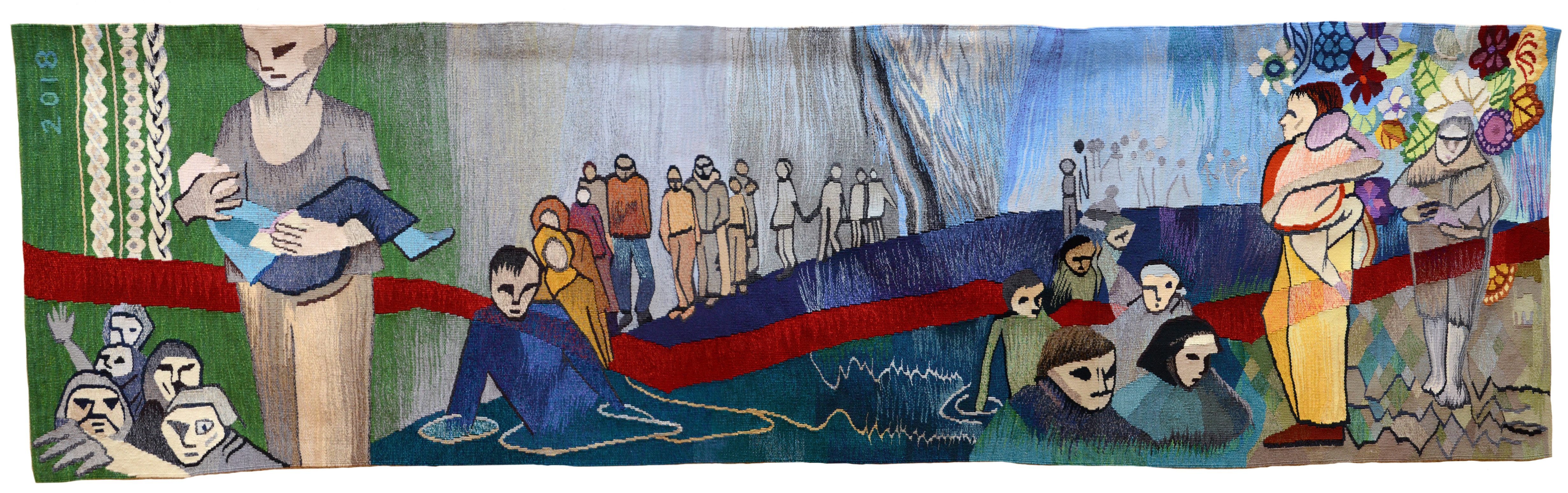
Crowe’s artwork depicts a dialogue with her surroundings that is both contemplative and imaginative. Viewing her work often leads someone to be swept into her rumination. Memory, emotion, and the storied scenery of Ireland have often been the focus of her tapestries throughout the years. Crowe’s recent tapestry Displaced has taken the artist’s interaction with her surrounding into different territory. The plight of Syrian refugees – their perilous travels over the Mediterranean Sea and search for a safe haven – led her on a journey. Crowe studied The Great Irish Famine of the 1840s. In this she found connections between the journey that her forebears took to North America and the current experience of Syrian refugees. This process began with historical study and an examination of the current crisis. Crowe then had the opportunity to teach refugees to weave and heard their stories firsthand. This developed into dynamic artwork. Displaced is intended to tell a story of forced migration and its tragic realities for the diverse communities that share this experience. With this work, the depth of Crowe’s ability pulls the ancient expression of tapestry through time to connect people of many nations and open a space for communication.
Displaced has a far-reaching impact. Earlier this year, Crowe was invited to be a round-table speaker at the Premier International Tapestry Exhibition in Oakville in Toronto, Canada. There, she discussed her knowledge and opinions about the future of contemporary tapestry as an art form. Displaced was also on view at the exhibition.
“CHALICE OF MEMORIES”
“HELICOPTERS IN WATER”
The artist also engages communities through education. Crowe continues to teach, but in a different capacity. Her weaving studio serves also as a workshop space. The whimsical setting is complete with a garden. Crowe teaches both adults and children, and when asked, keenly describes how each population approaches art making. “Children are like an open book. They LOVE everything about my studio, the garden, the materials, the creativity, the process, and just having fun learning. The adults usually come with some preconceived notions about weaving a panel for the sitting room wall, only to discover there is a lot of learning involved, much practice, and development is very slow. However, there is a growing community of eager learners out there of all ages.” Dublin’s National College of Art and Design no longer offers a tapestry course of study. Contemporary interest continues to grow, drawing people to workshop classes.
“TURMOIL”
Since the completion of Displaced, Crowe has continued to explore social and cultural commentary through tapestry. Turmoil is the story of what Crowe calls “the Graveyard in the Sea.” It is another tragic image about the realities of current events. “Since I finished weaving the Displaced piece, I immediately begun work on a tapestry which I call Turmoil. It has not been shown anywhere as yet. The image relates to a family struggling and becoming submerged in the ocean. I hope I have created a very beautiful tapestry about a very dark almost daily event happening in Europe.” Next, she will explore new territory and introduce new materials: “Currently I am creating a new body of work based on the ‘Disappeared.’ People who leave home for one reason or another and never return. I am experimenting with new materials and hope to weave a shadowy almost transparent image of a mother and child. The warp is nylon yarn stretched over a homemade metal frame. This work will be shown at an exhibition in the Roscommon Arts Centre opening on August 11th 2019.”
Learn more about Frances Crowe and view this video from Mimar Media about the creation of Displacedhere.
Brooke Palmer is painting in his Toronto, Ontario studio prepping for The Artist Project. The four-day exhibition, held in Toronto, Canada from February 21-24, features 300 artists and will be held at The Better Living Center. The artist is also a stills photographer in the film industry and IT: Chapter Two (2019) has recently wrapped, giving him space to step back from the camera.
“It’s been an interesting career. It’s never the same day twice,” Palmer says. Most shoots average around two-to-three months, during which the stills photographer is present for every scene to capture images for publicity and media. Palmer’s photos become the movie posters and Instagram posts (among other modes of advertisement) that draw people to the box office and Netflix. The hotly anticipated IT: Chapter Two was a four-month long shoot. As the stills photographer, Palmer was present 5-6 days each week for up to sixteen hour days. Of his lengthy career, he says, “You’re constantly working on new projects with new crews, and new actors, and new stories, new locations – sometimes different cities. It changes, and it never becomes boring because you are never in the same place for very long.” In this pause between film projects Palmer is creating expressive works, paintings that are emotive in their depth and form. The fast-paced film world is a contrast to painting. Modern-day binge watching makes the world of film and television increasingly passing, as people consume one episode or film only to want another. Viewing a canvas makes us pause. The world contained inside its dimensions speaks to another side of the artist.
Stills from “Jigsaw”, “Hannibal”, “Hemlock Grove”, “It”
“Free Diver”
Painting has come in and out of Palmer’s life for years, leading up to this stage where he is immersed in the practice. “I started painting about thirty years ago before my first child was born. Throughout the years I would be drawn to periods where I painted quite a bit, and then there’d be sort of fallow periods where I would go a certain length of time without painting anything.” Four years ago, Palmer felt that it was time to have studio space and commit to the process of art making. “Those kinds of choices pushed me to paint on a regular basis and more seriously, because I was making not only emotional commitments to it but financial commitments to process, to sell. I was sort of pushed more intensely to see what I could produce and to try to get some results out of it.” Palmer’s effort has led to several exhibitions and garnered the attention of art collectors worldwide. International clientele of Toronto galleries, as far away as Iran, own Brooke Palmer originals. Still, like many artists he finds that saying goodbye to the work has two sides. Knowing that someone else connects to the work is exciting, but letting deeply held pieces go isn’t always easy. Among them Palmer counts ‘On Iridescent Wings’ and ‘Passage to Heaven.’ “At the end of the day it does leave me with a feeling of satisfaction and gratification to know my art is providing joy in a total stranger’s life. Selling pieces also opens both the physical and emotional space to embark on new creations and this keeps the creative process constantly moving forward. It’s a win-win for all involved.”
“Leviathan”
The creative process begins with a loose, unstretched canvas “that allows me to manipulate the canvas and to create values and depressions,” says Palmer. He then pours the paint on the canvas to create shapes and qualities of movement. The first color dictates what the next will be, and layers continue to form a dynamic whole. The translucent quality is created with water “to soften the edges and cause one color to run over the other,” he says. Layers of warm colors can become luminous, “creating the illusion of the painting sometimes being lit from within. If you have beautiful yellows or oranges underneath darker colors, sometimes they appear to illuminate the painting as a whole.” Unexpected colors can emerge from the process of mixing, layering, and adding water. The play of color, the mood and dance of this process, has Palmer captivated. “The outcome is never guaranteed or completely predictable. And sometimes what I started off intending to do and what the end result is are very different,” says Palmer. The layers of various colors cause each painting to become a kaleidoscope of its own.
Like painting, stills photography began with one image that led to more, unexpected opportunities. In the late 1980s Palmer was an editorial photographer for magazines. His cover shot on TV Guide Magazine of Canadian musician Anne Murray caught the attention of film distribution company Alliance Atlantis Communications INC. He was brought on the set of the television series’ Ready or Not (1993), Flash Forward (1995), and Traders (1996) to capture stills and now has ninety-three credits on his resume. Highlights for the artist are Life with Judy Garland: Me and My Shadows (2001), meeting and photographing Elton John, and of course working on the IT (2017) franchise.
“Shapeshifter”
Palmer’s comfort with unpredictability is present in both his paintings and his film work. On the set of a film there a host of unknown factors. Each actor’s process is unique, as is the process of the producers and crew. “When you begin any film project the first day or two are really telling in terms of what the process will be like.” Building a rapport with each actor in their own way is essential to being able to shoot dynamic images of them. Shooting still photos while filming is taking place, some actors need more or less space or respond to different angles. The subtle balance of interacting and blending in is an art form. With painting Palmer allows the colors to be, interacting by occasionally thinning their edges and applying a gentle hand, trusting in what will emerge. “I like the unknown part of [painting]. Every time you start one there’s opportunity to be surprised and take it in another direction, which I think is one of the most intriguing parts about making art and painting.”
“Random Childhood Recollections”
Still, the difference between the two artforms is distinct for Palmer. “I have spent over half of my life on film sets. I have had a great career and enjoyed the ride. The world of film and television is transient. We live in a world of voracious consumption. People love a particular TV series or a film and almost immediately after consuming it are on the hunt for the next show or film to become infatuated or obsessed with. It is impermanent, fleeting.
“I believe we reach an age in life where we reevaluate what our purpose is here on earth and in this life. We take on ‘legacy’ projects. We begin to examine and work towards the important question of ‘What are we going to leave behind?’ when our time is finished here. Without question, my 6 beautiful children are by far my greatest achievement and accomplishment. A father could never be more proud of his children than I am of mine. Still, I cannot help smiling, and I actually felt a chill run up my spine in contemplation of this thought. Someday, far into the future I hope, my paintings will live on and hang in the homes of my beautiful children or a complete stranger. ‘Who made this painting?’ someone will say. ‘My father’ could be the reply or, ‘There was an artist named Brooke Palmer who’s work charmed and captivated me.’”
View Palmer’s work at The Artist Project in Toronto, Canada from February 21-24, 2019.