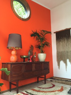
Photo: Courtesy of Lyndel Miller
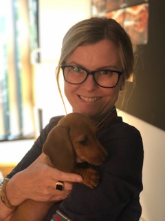
Diverse creative roles have been explored on Ordinary Artisans. Today’s story takes us into new territory with Lyndel Miller, a high-end product and food stylist. She has worked for print publications, commercial ads, and artfully arranged delicious-looking dishes on film (Swinging Safari [2018], Jungle [2017], and Netflix’s Tidelands [2018], among others.) An author, artist, and mentor behind The Styling Coach Sessions, Miller credits her versatile experiences with preparing her for where she is today. In a Q&A all the way from Brisbane, Australia, she tells the story of her journey from Naturopathy into styling, celebrating the creative challenges along the way.
How did you get started in the styling business?
I decided I would dedicate 12 months to trying to create a career in the industry. If I had no success or it wasn’t what I had hoped for, I would return to the Health Sciences and further my studies.
So, I studied, read, read a little more, practiced, practiced a little more and reached out to my community, speaking about what I hoped for. Not long after, a mutual friend connected me to a photographer who at the time was wishing to extend her portfolio in food photography. We met, hit it off and did a test together. Not long after she booked me for a commercial shoot. It was a rather ambitious one at that but we both nailed it. The rest is history, as they say. We’ve worked together ever since. I really have to say it felt serendipitous. Someone up there was looking out for me. It was just what I needed. I was off and running! Right place, right time.
Was this something that you wanted to do since you were little?
Ah, no, I always romanced the idea of being an artist, but I had no faith in the idea or myself. It felt out of my reach.
After high school I went on to pay for my own education, so when it came to furthering my studies I felt my choices should be pragmatic. At first, I studied Naturopathy as I had been cooking for leading health retreats. It seemed like the next logical step at the time. I had a lot of experience in hospitality growing up. I wasn’t interested in being a chef. Though I wish I had been encouraged to do so back then. I certainly did the hours. I did Graphic Design And jewellery making in my free time (I do bore easily).
I had a health clinic for several years but when I fell pregnant with my first born, I shut shop, with no intention on my mind of returning. I knew I needed something more. Different. I went on to study Interior Design and started painting and exhibiting my abstract nature inspired artworks.
Food styling always felt like a marriage of all my past experiences. All the past work granted me the necessary and broad range of skills I needed to work successfully in the industry. I also style product, interiors and lifestyle shoots. It all feels rather natural.
In retrospect I wish I did Bachelor of Arts, as I wonder what I may have achieved. But maybe I would be in exactly the same position.
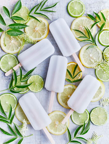
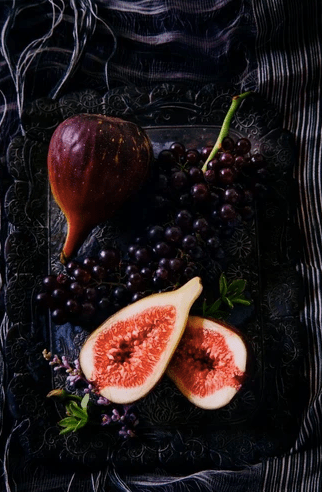
Photo: Courtesy of Lyndel Miller
What made you interested in food styling?
I love food! I come from a family of foodies. I picked up an American book on photo styling, by Susan Linnet Fox. It was a page turner for me. I resonated with every page. It’s what motivated me to start in the first place. And food styling seemed like the perfect place to start. There also weren’t many around in Queensland. There still aren’t. But having said that, it’s a small industry.
What has surprised you the most about what you do?
The higher you reach the less egocentric the environment is. Thankfully. I found this rather surprising.
Working in film is a great joy. There is a real sense of teamwork and appreciation for each other. I value the opportunities highly and enjoy the comradeship.
Food styling is not as simple as it seems. Can you tell me about what takes place in each stage of production?
It’s not actually, not on a commercial level. It just ain’t all making pretty. What’s required for each stage? Mmm. I can’t really articulate stages. Each project is truly unique. It’s a process but very rarely the same one. It helps to be a multidisciplinary stylist. The more resourceful you are the better, and each job brings you another level of understanding, dealing with various individuals, their briefs (or lack of), client, logistical and budgetary restraints – all of which determines how you approach the job, meet and nail the brief. Stylists are also problem solvers. This comes into every brief. How to reach desired outcomes is at the forefront.
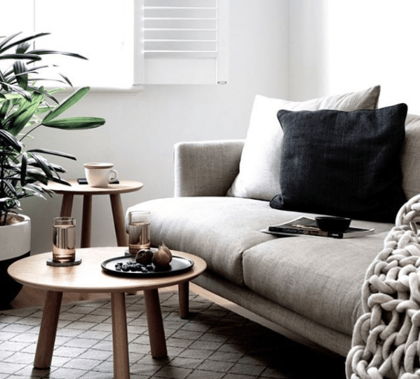
Photo: Courtesy of Lyndel Miller. Durham House, The Design Files, 2019.
You’ve styled food on films – Swinging Safari (2018), Jungle (2017), and San Andreas (2015). What is it like styling for a film?
Ah, I love it! Especially Swinging Safari! Meeting Production Designer Colin Gibson was a thrill, as he worked on Award winning Australian series Love My Way, which is my all-time favourite series, even now. Also, the amazing Justine Dunn who I’ve worked with on several jobs, San Andreas, and Tidelands. I’ve worked with some phenomenal crew.
I also had teeny parts on ABC series Harrow and Netflix’s Tidelands. Just cameos but all the same, it’s a joy.
It’s very rewarding even if it’s just the smallest of contribution, it’s a privilege to be asked to participate and support an Art Department with their bigger picture.
What are some unusual projects or highlights?
This year, it was a stunning still life brief for upcoming Regional Flavours Food and Wine Festival held in Brisbane. I was given creative license to present the regions fresh produce as an art form. It’s inspired me to create a print series which will be released later in the year.

Photo: Jessie Smith. 2017.
What is your favorite food to style?
I love to style oysters! I’m very drawn to the exotic… salads are also very satisfying. Setting a scene for a feast! The ultimate as I get to play more! Plus, I love a challenge.
What is the most difficult food that you have worked with?
Butter! Whilst it’s not the most difficult generally (or doesn’t have to be). My most difficult project was four days shooting in Hong Kong. We had many holdups with failing Airconditioning, power and refrigeration. One crew member cut them self badly, another had a motorcycle accident. On top of that, a very ambitious client. 100’s of butter curls and cheese pulls! It was a challenge and exercise in patience and endurance. We worked for 23 hours straight, but the crew was phenomenal. We managed to have a lot of fun, and many lifelong friendships were made. But, as you can imagine, it was exhausting. I fell in a heap afterwards.
This is a silly question, but do you take care to arrange your own food at home or judge the plating when you eat out at restaurants?
Haha, I am asked this so often. Weekly. So, it’s not a silly question. I’m pretty relaxed at home. I love fresh, pleasant style food, shared plates, when everyone just serves up their portions and dig in. I only lay it all on for special milestone birthdays and Sunday family lunches – I consider the plating and propping. And I’m not one to judge others. I am however disappointed dining out if there is no sign that the food presentation isn’t considered. Can’t stand wilted salad greens, and any short cuts. Food deserves time, and you can taste a lack of care. I love visiting restaurants when the chefs take the food to art.
You’ve authored two books, “Naked Cakes: Simply Beautiful Creations” (Murdoch Books 2015) and “Wild Sugar Desserts” with Skye Craig (New Holland Publishers, 2012), with recipes and whimsical, artistic cake designs. What inspired you to write and share some techniques?
“Wild Sugar Desserts” was a co-authorship. Skye Craig used to work as a graphic designer for my husband’s business. We had a mutual appreciation for each other’s work. I was an exhibiting artist at the time with a background in design. Skye initially engaged me as consultant and stylist a few weeks into discussion around the book production. We decided that a nostalgic approach was fitting for this genre.
Skye asked me to author the book with her. She contacted the publisher and her agent, I submitted some recipes, an outline and we got the go ahead. It was very exciting, but all very consuming for a good 12 months. I learnt a lot! I created and tested about 100 recipes in the process. It was labour intensive. The design process for propping and plating was an equally, if not more, exciting experience. I invested a lot into it, and who couldn’t. It was an amazing journey. It was very successful in Sweden. Go figure!
A year later I went on to produce cookbooks for self-publishers. I enjoyed the processes so much I wanted to assist others in creating their projects.
The second book idea I pitched to Murdoch Books. It was one of two pitches. To be honest I didn’t think it was the most favourable. It was a book idea for a gap I saw in the market for the growing and trending love for The Naked Cake. Many books came after mine, but it was the first on the subject.
I love a celebratory cake! I’m actually not a sweet tooth but birthday cakes have always been a big deal in my family. My kids get to choose the style of cake they want, the flavour profile, and the setting in which it’s delivered to the table. The book was ultimately about this. There were some aspects of the book that I was asked to produce (the crafty elements and D.I.Y. tutorials) that I wasn’t too keen on.
I’m very grateful for the opportunity! It gave me a great body of desserts in my portfolio. 70 odd. And extracts of the book were published all over the world thanks to my amazing publishing manager. It just wasn’t a true reflection of my style, so that’s hard to swallow. But it has been successful (for a nobody) and it’s been printed for UK and German market. It was a blessing(!) as I was just starting out as a food stylist. Having said that my first paid gig was a high-end kitchenware client, producing their annual Christmas catalogue.
Photo: Mindi Cooke. Kalka Homes. 2017.
On Instagram you’ve mentioned that you collect vintage glassware. Why do you love colored glass?
What’s not to love ! Vintage glasses offer eye-catching colors and an array of shapes and patterns, unique decorative accent that recalls craftsmanship of times past. Colour also offers another layer and interest. And most importantly they are usually smaller in size and make for a more user-friendly prop, for stills anyway.
They also just add to a dining experience. I’d rather sip from an alluring vintage glass than a regular highball. Who wouldn’t? I’m a hedonist. It’s all about pleasure. It is also a nod to sustainability.
What are some standout pieces in your collection?
I love them all, but the standout? A pair of mid-century brandy balloons with gold trimming. These were gifted to me by my mother. I think the artist is Brownie Downing. I’d love to know who made them. Maybe one of your readers may know. I have my Friday night Gin and Yuzu cocktail in them. They are a treasure. They are playful and well, I’m sentimental. I won’t use them as a prop, they are just for me. I’d die if I broke one.
I also have some rather space age looking martini glasses. Much like the ones you may have seen in the recent Starwars: The Rise of Skywalker movie and club scene. Designer Tom Ford has a similar range out now, reminiscent of the 60s.
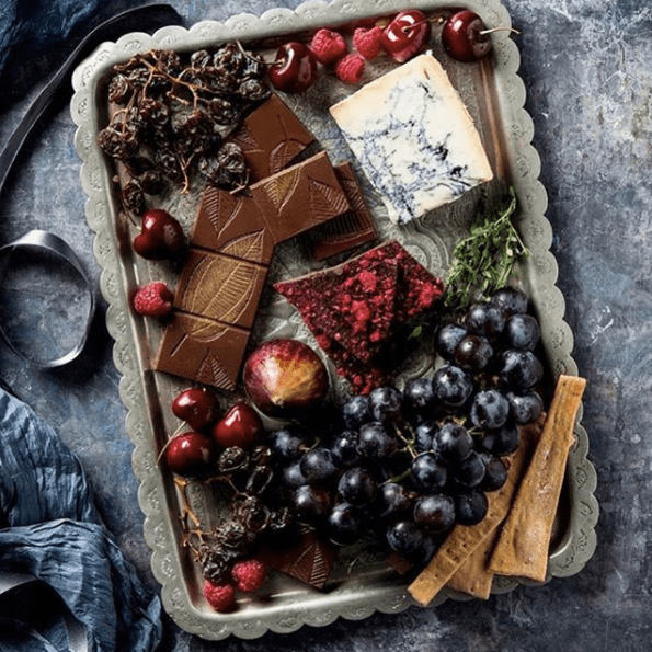
Photo: Mindi Cooke. New Farm Confectionary. 2019.
What is your favorite era of food styling and why?
Right now! We are seeing a resurgence of still life, echoing the Dutch Masters but with restraint. This excites. But I’ve always dreamt about working on a massive food scene like the ones you see in Harry Potter or Game of Thrones. Big budget! Mountains of produce and detail.
Having said that, working on the movie Jungle with Daniel Radcliffe was extraordinary. That brief was demanding which I thrive on, stimulating and enjoyable. I got to sleep on the set the day prior at Versace also. Smiling widely. Dream job! Dream crew.
What are your upcoming projects?
I can never give away what’s up next, but it’s a mixture of food, product, and lifestyle stills and TVC’s. Business as usual but I’m finding the caliber of work I’m receiving is exciting.
I’ve also just recently launched ‘The Styling Coach’ sessions. They are crash courses in photo styling. I’m not one to rest on my laurels. I love to have a few projects on the boil.
These 1:1 sessions are geared for small business startups wanting to learn how to better style their products and images for social media content. And, for corporate hotel groups wanting to give their marketing teams insight into the craft of food styling and how they can up their game plan for their social media posts. It’s been a great success.
I’ve also vowed to myself to produce more personal projects, which I haven’t done for years since my last book. I’m collaborating with a few photographers this year to create print series for interior decorators/ designers and public alike. I’m returning to my art. Painting. This time not just making photographic backgrounds for camera.
I want to spread my wings a little more this year and make time for my own creative urges. I’m writing more and always trying to up-skill.